New visual identity for Rotorua
Rotorua Economic Development (RED) chief executive Andrew Wilson shared the new brand with elected members at today's Operations & Monitoring Committee meeting, explaining the process, the inspiration and how it will be rolled out over time.
The work was funded by MBIE and aims to connect all Rotorua brands, sub-brands and programmes/campaigns into a unified identity that truly reflects "who we are as a place", Mr Wilson explained.
The new destination brand is about the future and moving through the current times, he said.
It incorporates Te Arawa's vision for the future and had input from a wide range of stakeholders who were consulted to help define what makes Rotorua a great place to live, work and visit.
You can go directly to this part of the recording of the livestreamed meeting via this link: https://youtu.be/SonaqwTDpTk?t=3281 and see more below.
MEDIA RELEASE ISSUED BY RED TODAY:
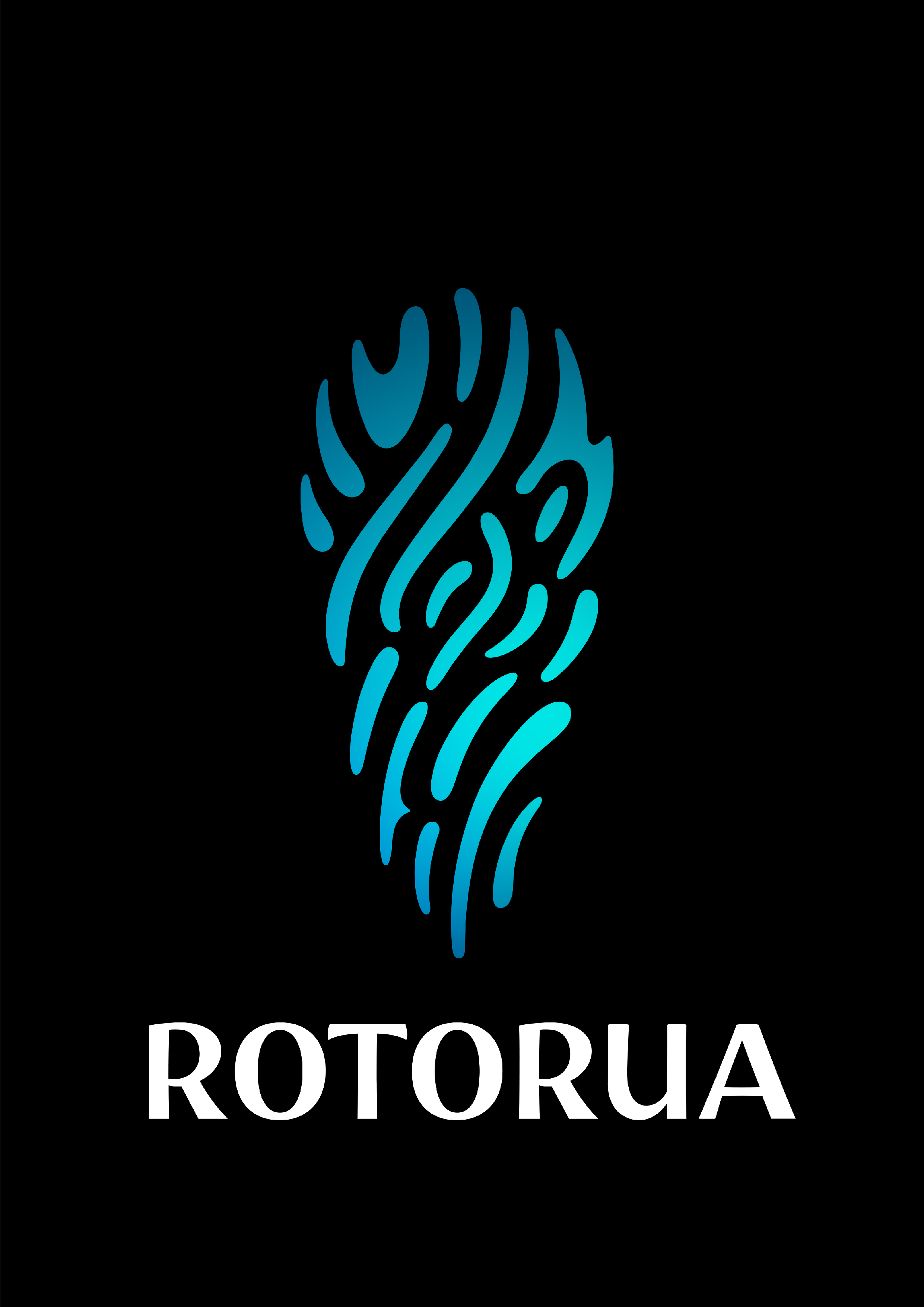
A two year journey has culminated in the creation of a stunning new visual identity for Rotorua.
New Zealand Māori Arts and Crafts Institute’s lead designer Stacy Gordine and General Manager Eraia Kiel worked with design agency DesignWorks, to develop a tohu (symbol) that represents our city.
Destination Rotorua’s Head of Marketing and Insights Jo Holmes said the new tohu will provide a strong visual cue to bring the destination’s brand identity to life.
“When you look at some of the best known destination brands around the world, the logos are all based on physical structures or natural elements - think of the Eiffel Tower or Sydney Opera House featured within the Paris and Sydney logos.
”We were so lucky to be able to work with local designers Stacy and Eraia, who have created a tohu inspired by the Pōhutu geyser located in the Whakarewarewa thermal valley.
“They’ve also gifted the cultural narrative behind the tohu, which acknowledges the eight beating hearts of Te Arawa and the 18 lakes found within the iwi rohe. The tohu symbolises the connection between earth and sky, past to the present, physical to spiritual. And best of all, it comes from within this place, from Rotorua designers.”
The two year process to develop a unified place brand involved consultation with a wide group of stakeholders to define what makes Rotorua a special place to live, work and visit. Particular emphasis was placed on consulting with representatives from Te Arawa throughout the entire process to ensure the brand reflects the unique nature of the destination and Te Arawa’s vision for the future.
“Everything we do to promote the destination is now linked to a single defining idea: It’s all found within Rotorua. That challenges us to always look beyond the surface, searching for the deeper stories, most meaningful experiences and putting our people in the centre.”
Additional information
- The work was funded by the Ministry for Business, Innovation and Employment through the Strategic Tourism Assets Protection Programme fund. The visual design component cost $55,000 which included the concept design, development of the new tohu and creation of the supporting toolkit and guidelines.
- Rotorua Economic Development has also been working closely with Rotorua Lakes Council to create a uniformed brand architecture that connects all of the Rotorua brands, sub brands and programmes/campaigns across Rotorua, Rotorua Lakes Council (RLC) and Rotorua Economic Development (RED). This is aimed at creating a long-term vision to shape a design system that helps inspire, unite, and accelerate Rotorua as one.
- The new visual identify will be shared with New Zealanders in a marketing campaign during April 2022 and will continue to be rolled out as assets are replaced over time.